Graphic↓
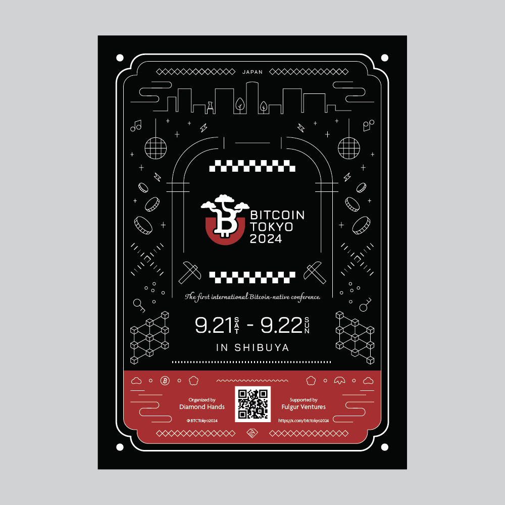
I designed flyers to hand out at a conference in South Korea. The goal was to let Korean attendees know about Bitcoin Tokyo 2024, to be held in Shibuya, Tokyo.
I packed in elements of Shibuya, aiming for strong visibility and a lasting impression on site.
At the center of the visual is the Shibuya Center-gai sign, surrounded by Shibuya icons such as 109, a mirror ball, Hachiko and the Scramble Crossing. Combining these with Bitcoin icons, I expressed a world of “Tokyo × culture × crypto.”
To make the logo the most striking element, only the logo is filled in and everything else is line art. Placing the weight of the color toward the bottom also draws the eye naturally to the logo.
I aimed for a style of graphic rarely seen in Korea, so that people would pick it up out of curiosity.
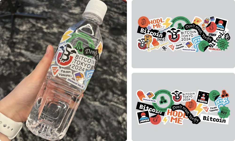
For the 500 ml water bottle (half label) handed out to attendees, the request was “something people want to take home and display,” so I explored a direction where the design works as a lifestyle item in its own right.
To make the most of the water's transparency, I used graphics that look like stickers on the bottle. This makes the whole bottle feel like a product, with a playful sticker-like look.
The bottom right is my original design, and the top right is the version actually printed, with sponsors and other details added.
I carefully adjusted the white margins to keep the balance without losing the sense of transparency.
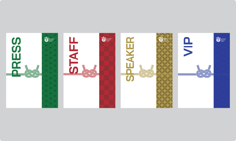
The attendee badges use a different traditional Japanese pattern for each attendee type. Each pattern carries its traditional meaning along with our gratitude toward the event.
Staff: Ichimatsu (checkered)
Speaker: Shippo (seven treasures)
VIP: Seigaiha (blue ocean waves)
Press: Asanoha (hemp leaf)
The overall shape is based on a noshi-bukuro, a traditional Japanese gift envelope, so the visual carries the meaning of a “gift” to everyone who took part.
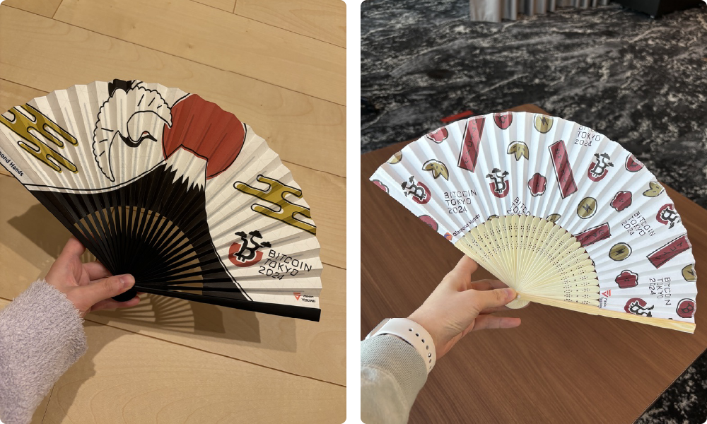
Since many attendees came from overseas, I chose a folding fan as a novelty that felt Japanese and was easy to take home.
For the design, I deliberately used misregistered printing like a woodblock print, giving it a hand-printed texture and warmth. I matched the graphics to the surface texture so it can be enjoyed by touch as well as by sight.
Throughout the project, rather than treating “Japaneseness” and cultural context superficially, I tried to convey them in a fun, natural, contemporary tone.
To make the designs feel familiar to visitors from different cultures, I valued visual strength, playfulness and attention to detail.